Transforming Complexity into Clarity: Oneflow’s Product Table Redesign
(1 minute version)
🔹 Role: Lead UX Designer
🔹 Company: Oneflow, a digital signing solution provider (B2B SaaS)
🔹 Collaboration: Product Manager, Core Development team, UX and CSM teams
🔹 Impact:
• -30% task completion time
• -25% user errors observed during usability testing
• Reduced amount of support tickets
Reusable skills gained
• Leading iterative UX redesigns balancing user needs and technical constraints
• Improving accessibility and efficiency
• Driving cross-functional alignment to deliver measurable impact.
The Problem
The Product Table was Oneflow’s most-used yet most-frustrating feature, leading to:
• Poor usability: unclear navigation, frequent misclicks.
• Rigid customization: columns broke when content was added, no flexibility.
• Technical constraints: code migration limited changes.
Product and Engineering had misaligned priorities:
Product wanted usability fixes, Tech wanted a minimal migration.
The Solution
To balance usability, tech constraints, and business needs, I led a phased approach:
• Phase 1: Quick wins: navigation clarity, alignment fixes, better placement of settings.
• Phase 2: Enhancing existing features: reorganized popups, tabbing fixes, real-time validation.
• Phase 3: New capabilities: font formatting, mobile responsiveness.
Key Learnings
• Small wins, big impact: prioritizing high-value changes delivers clear results.
• Real users, real insights: testing revealed unexpected friction (users missing existing settings) leading us to prioritize copy and navigation tweaks that made a big impact.
• Collaboration is crucial: alignment with product and engineering ensured smooth execution.
Why It’s Relevant
This project highlights my ability to:
• Design complex interfaces to be intuitive and efficient through iteration.
• Bridge UX, product, and engineering priorities to deliver scalable solutions.
• Use usability testing and metrics to validate real impact and guide decisions.

Figure 1. Using two 'hands-on' personas to support and guide the research process.
Transforming Complexity into Clarity: Oneflow’s Product Table Redesign (Full version)
The Challenge
The Product Table was critical for Oneflow users but plagued by frustration and inefficiency:
• Usability issues: settings were hard to find, column alignment broke unexpectedly, unclear copy.
• Rigid customization: users wanted more control over column formatting and layout.
• Technical debt: ongoing code migration limited immediate UI changes.
Internal misalignment:
• Product wanted usability fixes to reduce friction.
• Engineering wanted a minimal migration, resisting major UI changes.
To move forward, I advocated for an iterative approach, focusing first on high-impact usability fixes, while aligning stakeholders to balance constraints.
Research & Testing
To identify key friction points, I conducted usability tests before and after improvements, tracking:
• Time on task: how long it takes users to complete a product line entry.
• Error rate: misclicks and confusion around settings (e.g., removing columns, setting currency).
To deeply understand user needs, I:
✔ Defined key research questions: framed around reducing friction, improving customization, and simplifying key settings.
✔ Planned & conducted user interviews: focused on workflow challenges, customization needs, and usability pain points.
✔ Gathered internal insights: worked with CS & Sales teams to address common user frustrations and accessibility concerns.
To align product, design, and engineering, I led an OST (Opportunity Solution Tree) mapping using Continuous Discovery to prioritize improvements while working within tech constraints.
I collaborated with the Product Trio to define our key outcome:
Reduce the average product entry time by 20%, enabling users to create and send contracts more efficiently.

Figure 2. Continuously gathering feedback on the sketches.
My Approach
1️⃣ Phase 1 – Immediate Usability Wins
• Copy improvements: clearer vocabulary, removed ambiguous labels.
• Fixed column behaviour: prevented price figures from breaking across lines.
• Reorganized key settings: moved currency setting to the main price popup for better visibility.
2️⃣ Phase 2 – Enhancing Existing Features
• All-in-one product line popup: faster entry, reduced clicks.
• Improved tabbing & keyboard navigation: boosted accessibility & speed.
• Real-time validation & error prevention: prevented incorrect pricing formats.
3️⃣ Phase 3 – New Features for Scalability
• Implemented font formatting: previously only available in the editor.
• Made the Product Table responsive & editable on mobile: allowing quick adjustments on the go.
Design & Implementation
Phase 1: Quick wins: clarified navigation, better defaults.
Phase 2: Introduced customizable columns & product entry improvements.
Phase 3: Planned bulk-editing & deeper customization.
How I Led the Change
✔ Advocated for an iterative, user-centered approach: prioritized small, high-impact usability fixes first.
✔ Aligned product & engineering: ensured improvements fit within migration constraints.
✔ Improved accessibility: fixed tabbing functionality, making the Product Table fully keyboard navigable.
✔ Validated design decisions with usability testing & data, ensuring every change solved real user pain points.

Figure 3. Optimizing the responsive view of the product table.
Outcome & Measurable Impact
• -30% task completion time, making workflows significantly faster.
• -25% user errors, showing improved clarity and efficiency.
• Support tickets dropped significantly: Product Table was no longer the #1 complaint.
Bonus Impact:
The Sales team reported fewer deals lost due to Product Table issues.
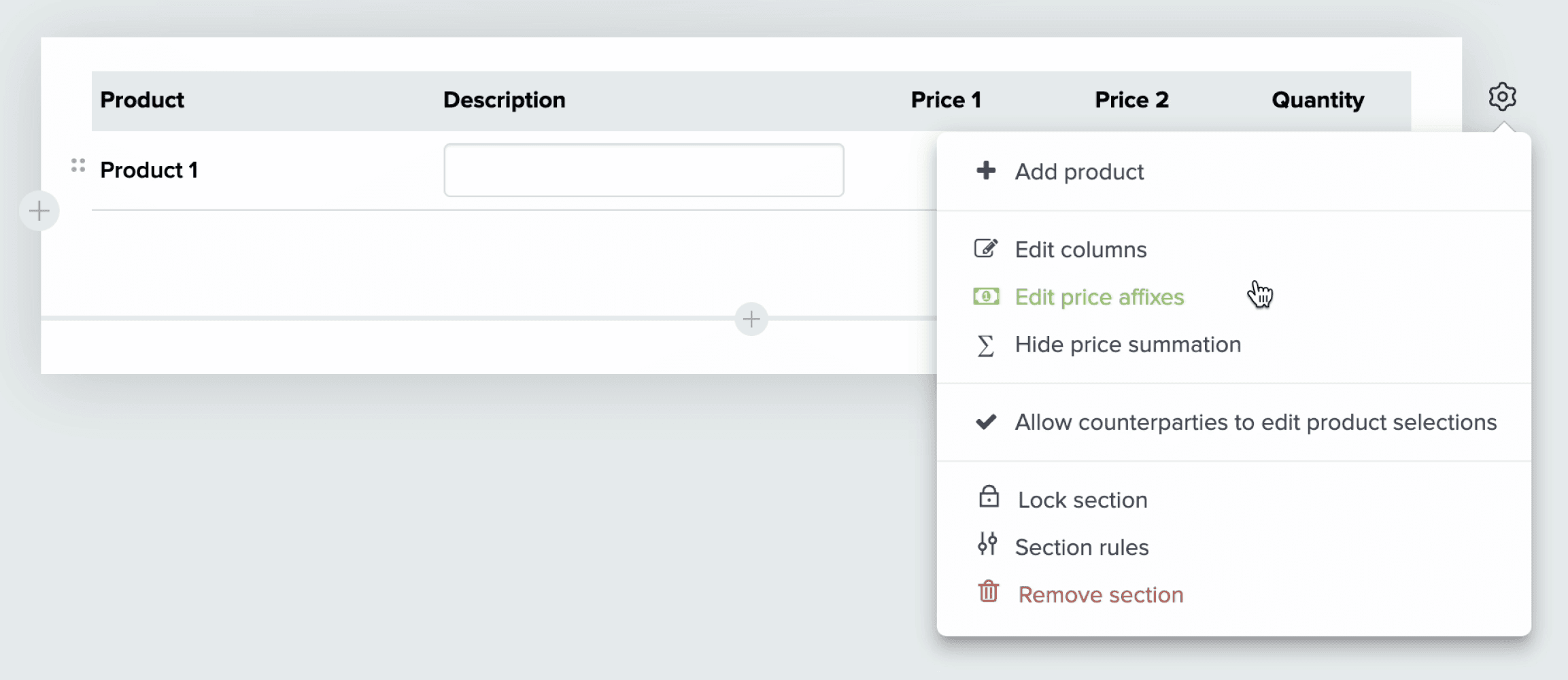
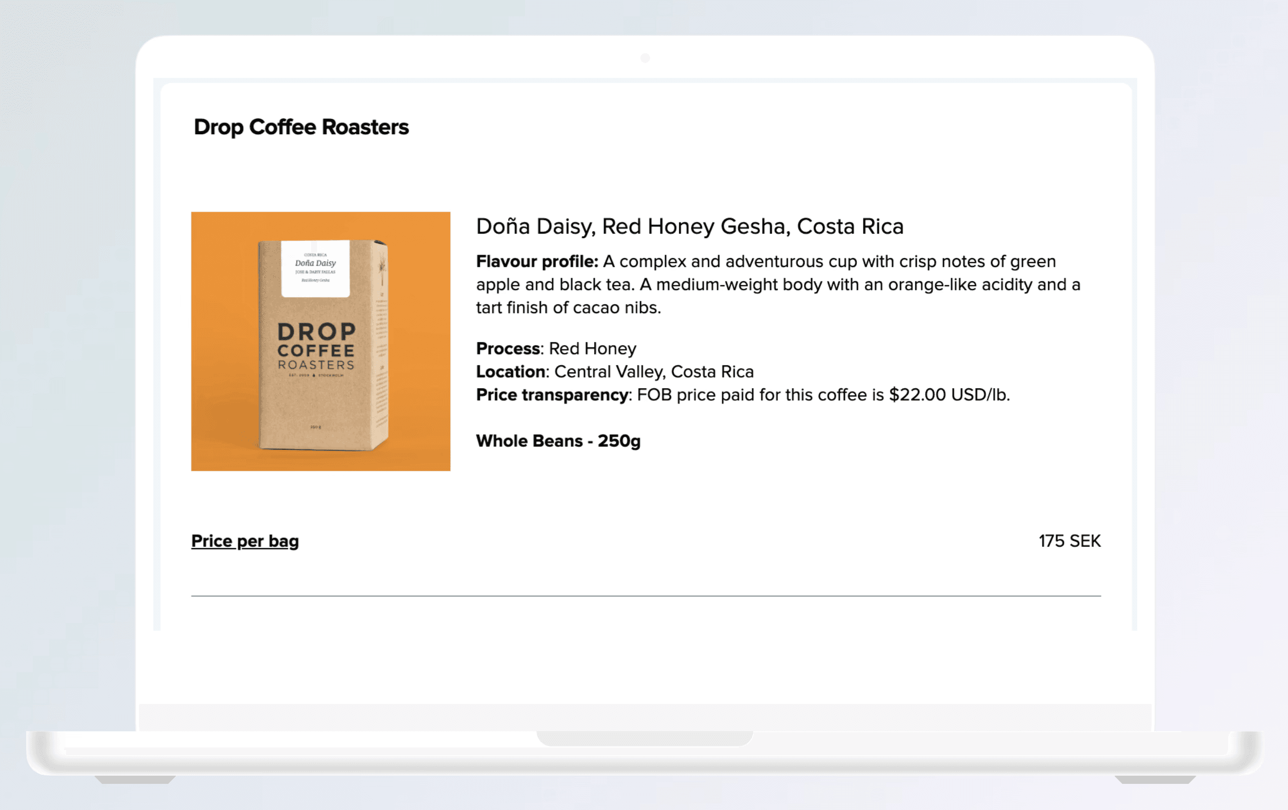
Figure 4. Before the re-design: lack of structure, unclear copy, inconsistent icons and accessibility issues (colour contrast).

Figure 5. After the re-design: settings reorganised for more intuitive experience, accessibility issues fixed, copy clarified.
Learnings
• Prioritization is key: small, high-impact improvements drive measurable results.
• User testing reveals unexpected insights: real-world behaviour shaped a more intuitive solution.
• Cross-team collaboration ensures execution: aligning product & engineering enabled seamless implementation.
Next Steps: Expand bulk-editing, advanced customization, and further mobile optimizations.
🔹 Reusable Skills Demonstrated:
• Leading iterative redesigns within technical constraints.
• Conducting user research and usability testing for workflow-heavy features.
• Driving accessibility improvements and mobile responsiveness in B2B SaaS tools.
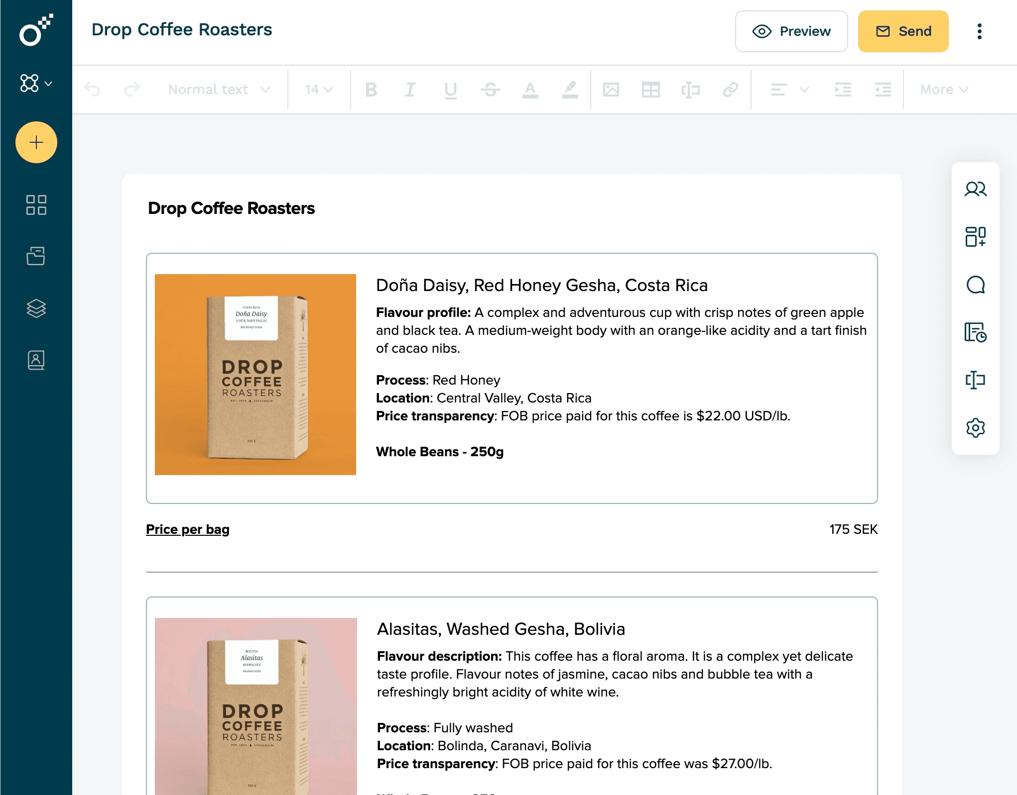
Figure 6. Responsive tablet view.


